Final video.
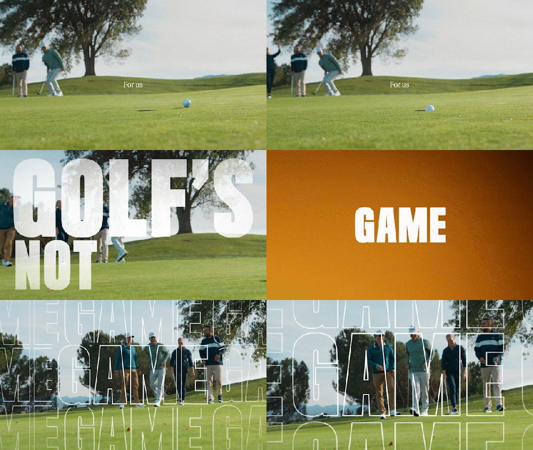
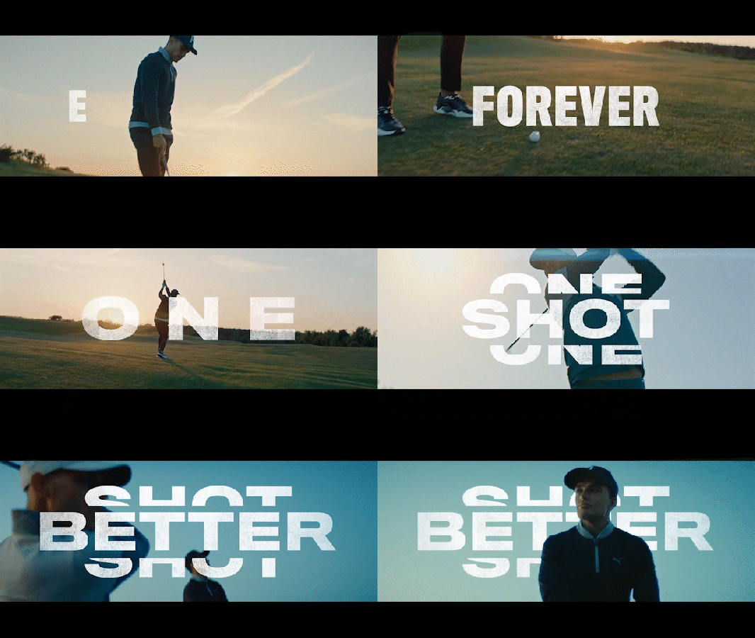
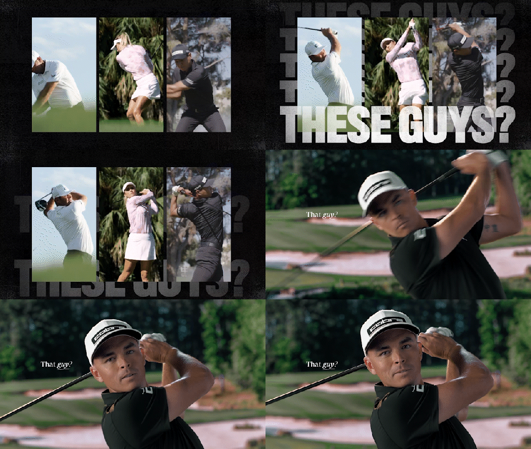
I worked with the creative team at Out of Nothing to create the animated titles that appear throughout this brand piece for Cobra Golf.


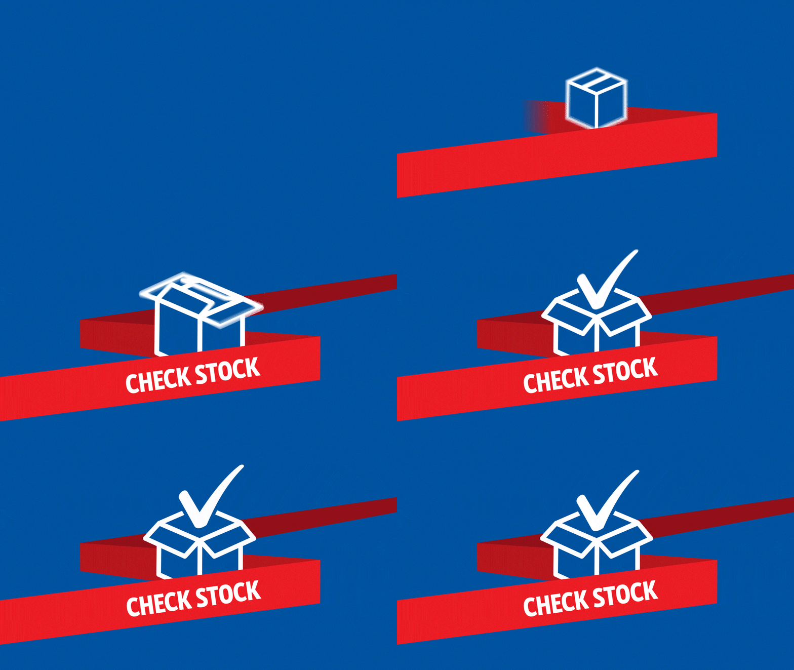
This project offered a lot of space for me to experiment with fun ways to animate the titles, making the most of the various font widths available for the chosen typeface. Some of the early concepts featured a lot of squashing and stretching of individual letters.
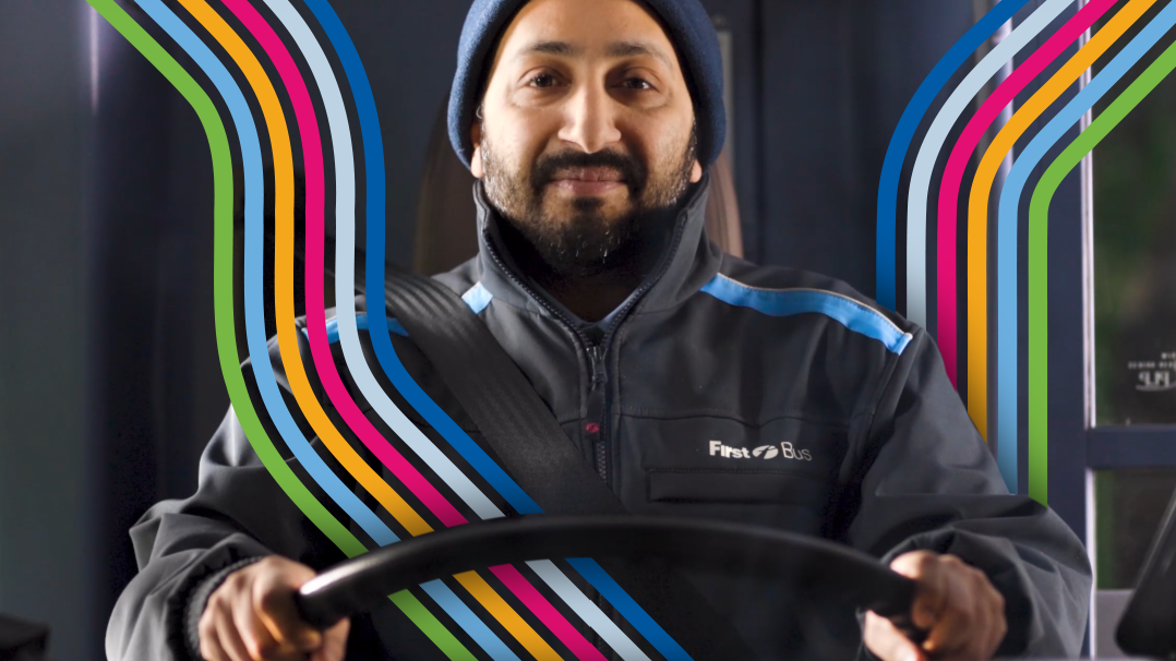
The final result used a combination of typefaces and fonts. The small, delicate serif text would sometimes highlight key words by underlining them or shifting them into italics. This contrasted well with the larger, bolder text which would dynamically shift and slide into view, often taking up a large portion of the screen and sometimes interacting with people and objects in the shot.
